Introduction
Microsoft has an awesome web site called SharePoint Design. It provides design guidance on beautiful and fast sites, pages, and web parts with SharePoint in Office 365.
However, it does not tell you how to create those beautiful web parts.
This blog series is intended as a companion to the SharePoint Design site. It provides code samples and detailed how-to information for every design topic.
It should help you create web parts that look exactly like the ones on the SharePoint Design site.
So far, we have discussed the following topics:
- Web Part Titles and Descriptions
- Property Panes, Part I
- Property Panes, Part II
- Property Panes, Part III
- Layout Patterns, Part I: The Grid layout
- Layout Patterns, Part II: The Filmstrip layout
- Layout Patterns, Part III: The Carousel layout
In today’s post, we’ll continue our discussion about the web part layout patterns and discuss the compact layout.
What is the Compact layout?
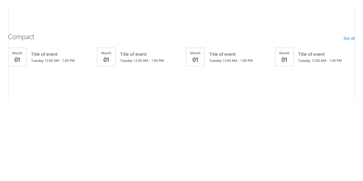
According to the SharePoint Design site:
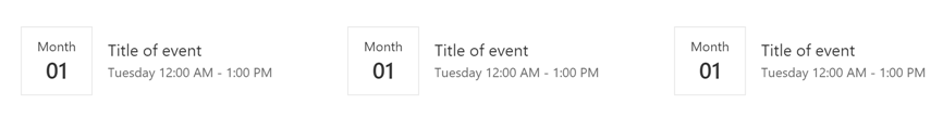
The compact layout is designed to show content in a smaller format and works the best in a one-third column. This layout can support a small image or icon and a few rows of text for a title, description, and/or metadata.
However, it seems that the compact layout is not only used in 1/3 columns. The SharePoint look book and the SharePoint Online Provisioning Service both make use of the compact layout with the Quick Links web part.
When to use the compact layout
Use the compact layout when the items in your web part have very little information. A title and an icon or a small thumbnail is pretty much all you’ll be able to fit it.
How is it made?
The compact layout is simply a Grid layout, but where the individual items use a compact document card layout instead of the full document card.
To create your own, you would use an Office UI Fabric List control and render each item inside the list with a DocumentCard control where the type of the DocumentCard control would be set to DocumentCardType.compact.
Or, you can simply use the component I built to make my life easier.
How to create a web part with the compact layout
Note: The source code for this sample can be found in the on my .
-
Create your own web part solution. For this sample, we’ll assume that your web part is called
CompactWebPartand that the component which renders the content of the web part is calledCompact. -
Copy the content of the
src\components\compactLayoutfrom to your own solution. You may need to create acomponentsandcompactLayoutfolder undersrcto do so. -
In your web part, load the items you wish to display. For this example, we’ll set them in your web part’s state and hard-code them in your web part’s constructor, but feel free to load any data you want to use. We’ll want to have at least a
titleattribute and athumbnailattribute, but — as you’ll see later — you can really display any information you want when you render each item.constructor(props: ICompactProps) { super(props); // Sample data generated at https://mockaroo.com/ this.state = { items: [{ thumbnail: "https://robohash.org/nostrumquiiure.png?size=48x48&set=set1", title: "Aerified" }, { thumbnail: "https://robohash.org/minimafugitenim.png?size=48x48&set=set1", title: "Viva" }, { thumbnail: "https://robohash.org/nihilbeataeculpa.png?size=48x48&set=set1", title: "Overhold" }, { thumbnail: "https://robohash.org/essequiquo.png?size=48x48&set=set1", title: "Latlux" }, { thumbnail: "https://robohash.org/inipsumtotam.png?size=48x48&set=set1", title: "Biodex" }, { thumbnail: "https://robohash.org/utmodiet.png?size=48x48&set=set1", title: "Bitchip" }, { thumbnail: "https://robohash.org/undeenimvel.png?size=48x48&set=set1", title: "Rank" }, { thumbnail: "https://robohash.org/pariaturoditdolore.png?size=48x48&set=set1", title: "Opela" }, { thumbnail: "https://robohash.org/nullaullamincidunt.png?size=48x48&set=set1", title: "Rank" }, { thumbnail: "https://robohash.org/accusantiumnonvoluptatibus.png?size=48x48&set=set1", title: "Bitchip" }, { thumbnail: "https://robohash.org/culpaeossapiente.png?size=48x48&set=set1", title: "Sonsing" }, { thumbnail: "https://robohash.org/harumnihilvelit.png?size=48x48&set=set1", title: "Duobam" }, { thumbnail: "https://robohash.org/quianesciuntet.png?size=48x48&set=set1", title: "Prodder" }, { thumbnail: "https://robohash.org/aliquidipsamrem.png?size=48x48&set=set1", title: "Keylex" }, { thumbnail: "https://robohash.org/dignissimoseosaccusamus.png?size=48x48&set=set1", title: "Span" }, { thumbnail: "https://robohash.org/exomnisexcepturi.png?size=48x48&set=set1", title: "Stringtough" }, { thumbnail: "https://robohash.org/occaecatimolestiaererum.png?size=48x48&set=set1", title: "Prodder" }, { thumbnail: "https://robohash.org/consequaturinquis.png?size=48x48&set=set1", title: "Alpha" }, { thumbnail: "https://robohash.org/sapienteofficiisest.png?size=48x48&set=set1", title: "Job" }, { thumbnail: "https://robohash.org/similiquesuntiusto.png?size=48x48&set=set1", title: "Cookley" }, { thumbnail: "https://robohash.org/sitnequequi.png?size=48x48&set=set1", title: "Stronghold" }] }; } -
In your web part’s component, add an import for the
compactLayout. You’ll also need an import for the UI FabricDocumentCardcomponent:// Used to render document cards import { DocumentCard, DocumentCardPreview, DocumentCardDetails, DocumentCardTitle, IDocumentCardPreviewProps, DocumentCardType } from 'office-ui-fabric-react/lib/DocumentCard'; import { ImageFit } from 'office-ui-fabric-react/lib/Image'; import CompactLayout from '../../../components/compactLayout/CompactLayout'; -
Add a
_onRenderGridItemmethod:private _onRenderGridItem = (item: any, _index: number): JSX.Element => { const previewProps: IDocumentCardPreviewProps = { previewImages: [ { previewImageSrc: item.thumbnail, imageFit: ImageFit.centerCover, height: 48, width: 48 } ] }; return <div data-is-focusable={true} data-is-focus-item={true} role="listitem" aria-label={item.title} > <DocumentCard type={DocumentCardType.compact} onClick={(ev: React.SyntheticEvent<HTMLElement>) => alert(ev)} > <DocumentCardPreview {...previewProps} /> <DocumentCardDetails> <DocumentCardTitle title={item.title} shouldTruncate={true} /> </DocumentCardDetails> </DocumentCard> </div>; } } -
Update your component’s
rendermethod to render the compact layout as follows:public render(): React.ReactElement<ICompactProps> { return ( <div className={styles.compact}> <CompactLayout items={this.state.items} onRenderGridItem={(item: any, index: number) => this._onRenderGridItem(item, index)} /> </div> ); }
That’s really all there is to it! You web part will render something like this:
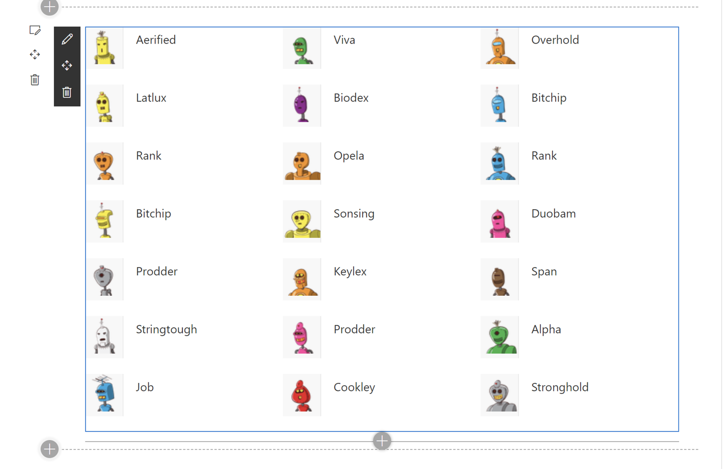
The great thing is that it is entirely up to you how you want to render each item. I chose to use the DocumentCard control, but you can replace any part of your _onRenderGridItem method to suit your needs.
For example, if you wanted to render a date instead of an thumbnail, you could use something like the that I wrote for .
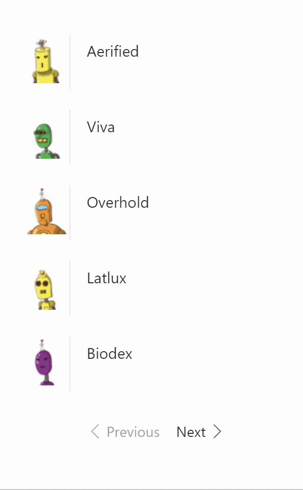
Adding pagination
When I first built the , the Events web part showed little Previous and Next buttons at the bottom of the web part when displaying in the compact mode.
It seems that the pagination has since been removed from the standard web part design. Nevertheless, I have included a sample control to show how you can add pagination to your compact web part.
Use it at your discretion.
To add pagination to your web part, follow these steps:
- Copy the content of the
src\components\pagingfrom to your own solution. You may need to create apagingfolder undersrc\componentsto do so. - Add a variable to store the current page number in your component’s state, as follows:
export interface ICompactState { items: any[]; currentPage: number; } -
In your component’s constructor, set the current page to
1, as follows:constructor(props: ICompactProps) { super(props); // Sample data generated at https://mockaroo.com/ this.state = { currentPage: 1, items: [{ thumbnail: "https://robohash.org/nostrumquiiure.png?size=48x48&set=set1", title: "Aerified" }, { thumbnail: "https://robohash.org/minimafugitenim.png?size=48x48&set=set1", title: "Viva" }, { thumbnail: "https://robohash.org/nihilbeataeculpa.png?size=48x48&set=set1", title: "Overhold" }, { thumbnail: "https://robohash.org/essequiquo.png?size=48x48&set=set1", title: "Latlux" }, { thumbnail: "https://robohash.org/inipsumtotam.png?size=48x48&set=set1", title: "Biodex" }, { thumbnail: "https://robohash.org/utmodiet.png?size=48x48&set=set1", title: "Bitchip" }, { thumbnail: "https://robohash.org/undeenimvel.png?size=48x48&set=set1", title: "Rank" }, { thumbnail: "https://robohash.org/pariaturoditdolore.png?size=48x48&set=set1", title: "Opela" }, { thumbnail: "https://robohash.org/nullaullamincidunt.png?size=48x48&set=set1", title: "Rank" }, { thumbnail: "https://robohash.org/accusantiumnonvoluptatibus.png?size=48x48&set=set1", title: "Bitchip" }, { thumbnail: "https://robohash.org/culpaeossapiente.png?size=48x48&set=set1", title: "Sonsing" }, { thumbnail: "https://robohash.org/harumnihilvelit.png?size=48x48&set=set1", title: "Duobam" }, { thumbnail: "https://robohash.org/quianesciuntet.png?size=48x48&set=set1", title: "Prodder" }, { thumbnail: "https://robohash.org/aliquidipsamrem.png?size=48x48&set=set1", title: "Keylex" }, { thumbnail: "https://robohash.org/dignissimoseosaccusamus.png?size=48x48&set=set1", title: "Span" }, { thumbnail: "https://robohash.org/exomnisexcepturi.png?size=48x48&set=set1", title: "Stringtough" }, { thumbnail: "https://robohash.org/occaecatimolestiaererum.png?size=48x48&set=set1", title: "Prodder" }, { thumbnail: "https://robohash.org/consequaturinquis.png?size=48x48&set=set1", title: "Alpha" }, { thumbnail: "https://robohash.org/sapienteofficiisest.png?size=48x48&set=set1", title: "Job" }, { thumbnail: "https://robohash.org/similiquesuntiusto.png?size=48x48&set=set1", title: "Cookley" }, { thumbnail: "https://robohash.org/sitnequequi.png?size=48x48&set=set1", title: "Stronghold" }] }; } - Add an import for the paging component at the top of your file:
import { Paging } from '../../../components/paging'; -
Change your
rendermethod to get a subset of items to show, as follows:public render(): React.ReactElement<ICompactProps> { let pagedItems: any[] = this.state.items; const totalItems: number = pagedItems.length; let showPages: boolean = false; const maxEvents: number = 5; // Use any page size you want const { currentPage } = this.state; if (true && totalItems > 0 && totalItems > maxEvents) { // calculate the page size const pageStartAt: number = maxEvents * (currentPage - 1); const pageEndAt: number = (maxEvents * currentPage); pagedItems = pagedItems.slice(pageStartAt, pageEndAt); showPages = true; } return ( <div className={styles.compact}> <CompactLayout items={pagedItems} onRenderGridItem={(item: any, index: number) => this._onRenderGridItem(item, index)} /> {showPages && <Paging showPageNumber={true} currentPage={currentPage} itemsCountPerPage={maxEvents} totalItems={totalItems} onPageUpdate={this._onPageUpdate} nextButtonLabel={strings.NextLabel} previousButtonLabel={strings.PreviousLabel} /> } </div> ); } - Finally, add a method to store the current page number in your state every time the page changes, as follows:
private _onPageUpdate = (pageNumber: number): void => {
this.setState({
  currentPage: pageNumber
});
}
Test your web part. You should now get a next and previous buttons at bottom of your web part.
Conclusion
The compact layout is simply a grid control which renders compact document cards.
In our next post, we’ll discuss the list layout!


2 Comments
Do you have an example handy for using the Document Card that just “gets” me a thumbnail like the out of the box webparts do for office documents? Like preview image etc… not a big icon of the file type.
Pingback: SharePoint Dev Weekly - Episode 50 - Microsoft 365 Developer Blog